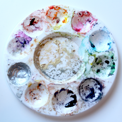
This is my first food coloring palette. I didn’t think ahead or put my colors in order; I was just discovering painting on cookies and I put colors into the wells as I needed them. It worked great. I somehow knew where each color was and it served me well.
I wanted to show you my messy, crazy palette because it doesn’t really matter what your palette looks like or where your colors are as long as you know the layout, but I will say I’ve learned a couple of things along my cookie painting journey and thought I would share.
When I started teaching cookie decorating and painting, I needed to make palettes for each of my students that were a bit more… shall we say user-friendly? This was my opportunity to think ahead and put colors into the wells in a way that makes sense. If you follow along in any of my McGoo U series, the numbers and colors used in the student palette below will be what I refer to.
While there are many palette options, this round, 10 well design is great because a lot of stores carry them (Michael’s, JoAnne’s, Walmart, etc) and you can’t beat the price at $0.99 the size is ideal and easy to store because it just happens to fit perfectly into a ziplock bag. The other feature I like is the large center well where I can mix colors and get it really messy.
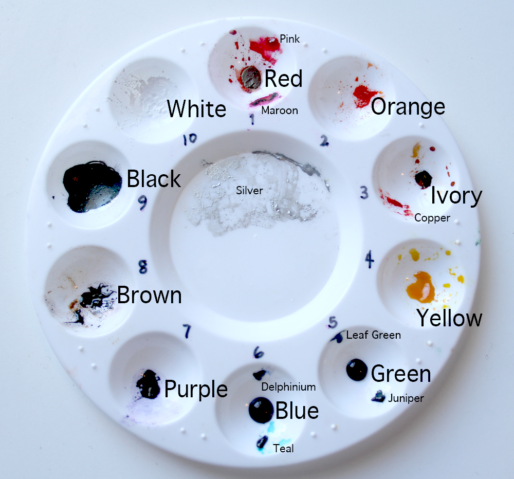
I like to think of the palette as a clock… that has 10 hours… and the 1 is at the top… okay so the clock analogy isn’t perfect okay? I number the wells from 1 to 10 and put a small amount of food coloring into the center of each well starting with
- Red
- Orange
- Ivory
- Yellow
- Green
- Blue
- Purple
- Brown
- White
- Black
Why Ivory? you ask. I use ivory quite a bit so it earned a dedicated spot.
Why are there other colors in your wells? you ask. I start with the basic colors, and add little amounts of the colors I use a lot of on the edge of the wells. These are completely optional, but add an infinite number of blending options and more depth because they are blends themselves. These “extra color cousins” that share wells are added as I need them. I can see adding peach or a neon cousin to some of the wells in the future.
As long as you know what and where your colors are, that is the important part because they can look quite unidentifiable. If you haven’t painted with food coloring before, you will be amazed at how far a little bit of color can go, especially when the colors dry.
Dry? you say. Yes! Please don’t think I put fresh color on my palette every time I paint. While I will use fresh food coloring, I very much prefer using it dry. When dry, the colors behave even more like a watercolor palette. All of the colors above are dry except the green and blue in the 5 & 6 wells are fresh.
And while we are on the topic of preferences… (Please feel free to use whatever brands you prefer or have on hand; these are merely my opinions and it would not hurt my feelings at all if you disregard this section) I prefer Wilton colors to paint with. They are not as gelatinous as other brands and in my experience, find they dry better. My black and white look a little different and they should: they are both powdered food coloring mixed with a little water. Why powdered? I have used liquid white food coloring and we are not friends. I have heard of people using liquid white and having great success with it, but I am not one of them. It. never. ever. ever. dries. The powdered versions dry beautifully and surprisingly play well with water, which is the only thing I paint with.
The powdered black I use, because if there is any chance of smearing, it usually happens with black food coloring. There is something about black food coloring that behaves differently than all the other colors and I find powdered black to be less risky. If you don’t have powdered black, regular black works great as well, just don’t use a lot of it (which I would suggest with the powdered black as well).
The large center well is where I can customize and blend colors as needed or add an additional color. Right now I have silver in the center, but that is ever changing.
Remember, the most important thing about your palette is that you get to know it. Happy painting!