Piping Better than Mediocre (And Sometimes Super Teeny) Logos
Ann (Suburban Madmom) Murad
Arty: In a word, my friend Ann is a conundrum. She is full of unexpected qualities and I just adore the heck out of her. The first thing you may notice is how colorful and sparkly she is, but did you know she has 6 adorable kids… SIX! (I’m one of six so I have a tiny idea of what kind of patience and multi-tasking that takes). She is gorgeous, but she has no ego. While she is a colorful character she has a very calm and loving aura about her. She is also one of the most patriotic people I’ve ever met and she is “straight edge”… I want to talk to her more about this and about a billion other things. But for now, I hope you all enjoy reading some great tips from this awesomely layered and always unexpected woman and artist: Ann!
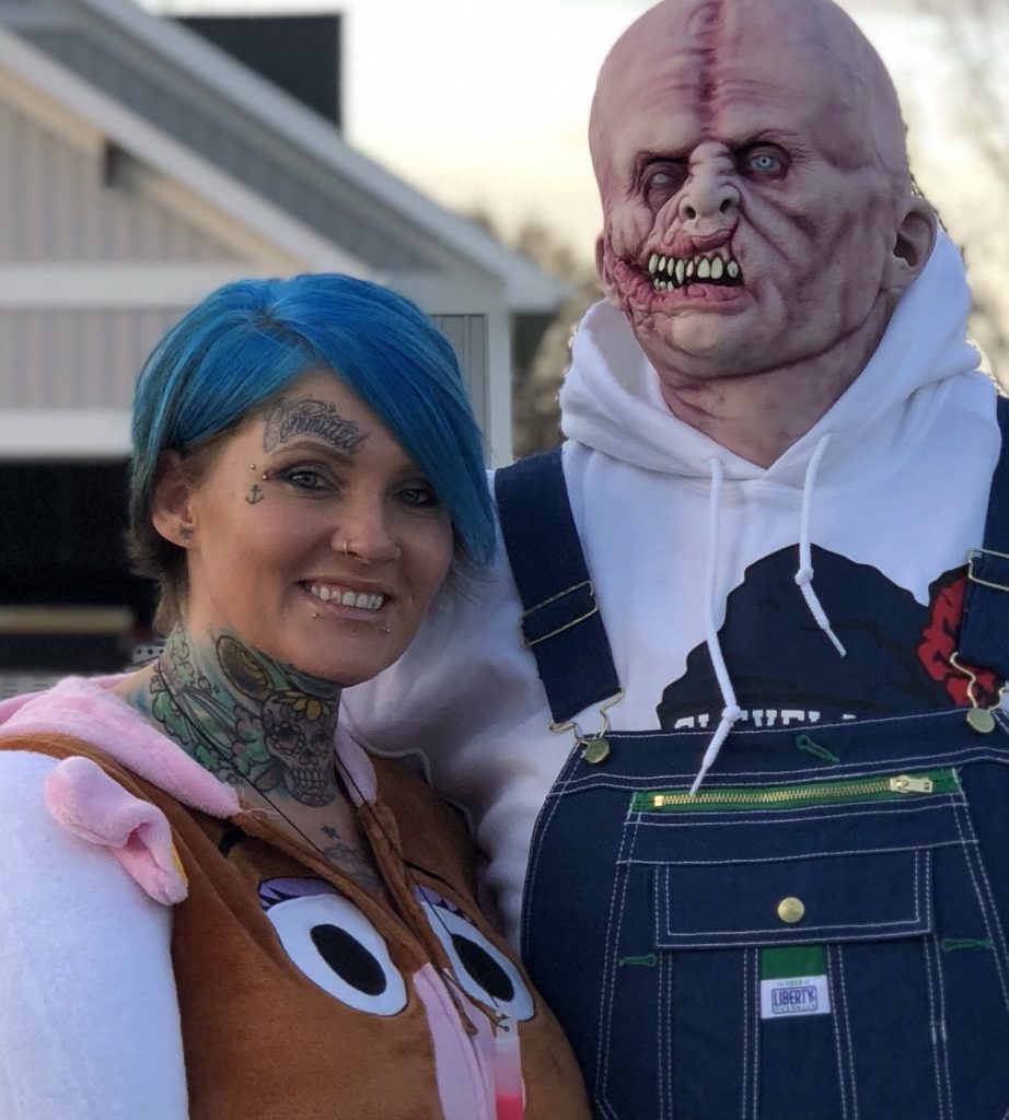
Ann and her handsome husband, Steve
When I was asked to do a guest blog post for the famed Arty McGoo I was overwhelmed with quite a few emotions. First and foremost, I was extremely flattered, followed by some slight intimidation, inferiority and ending with some determination.
With this holiday season marking my third year as a “cookier”, I still view myself as a rookie in the “Cookie World”. I don’t have to try to stay humble, because I already know there is ALWAYS more to learn. McGoo U has been a great tool for me to refer to when I need or want to try something I have yet to do. It’s also helpful to learn a better way to do some things that I’ve already done. With that, I’ve received so much valuable help and so many valuable tips about products used and how to do things. So it’s important to me that when someone asks me how I do what I do, I feel responsible to share the wealth.
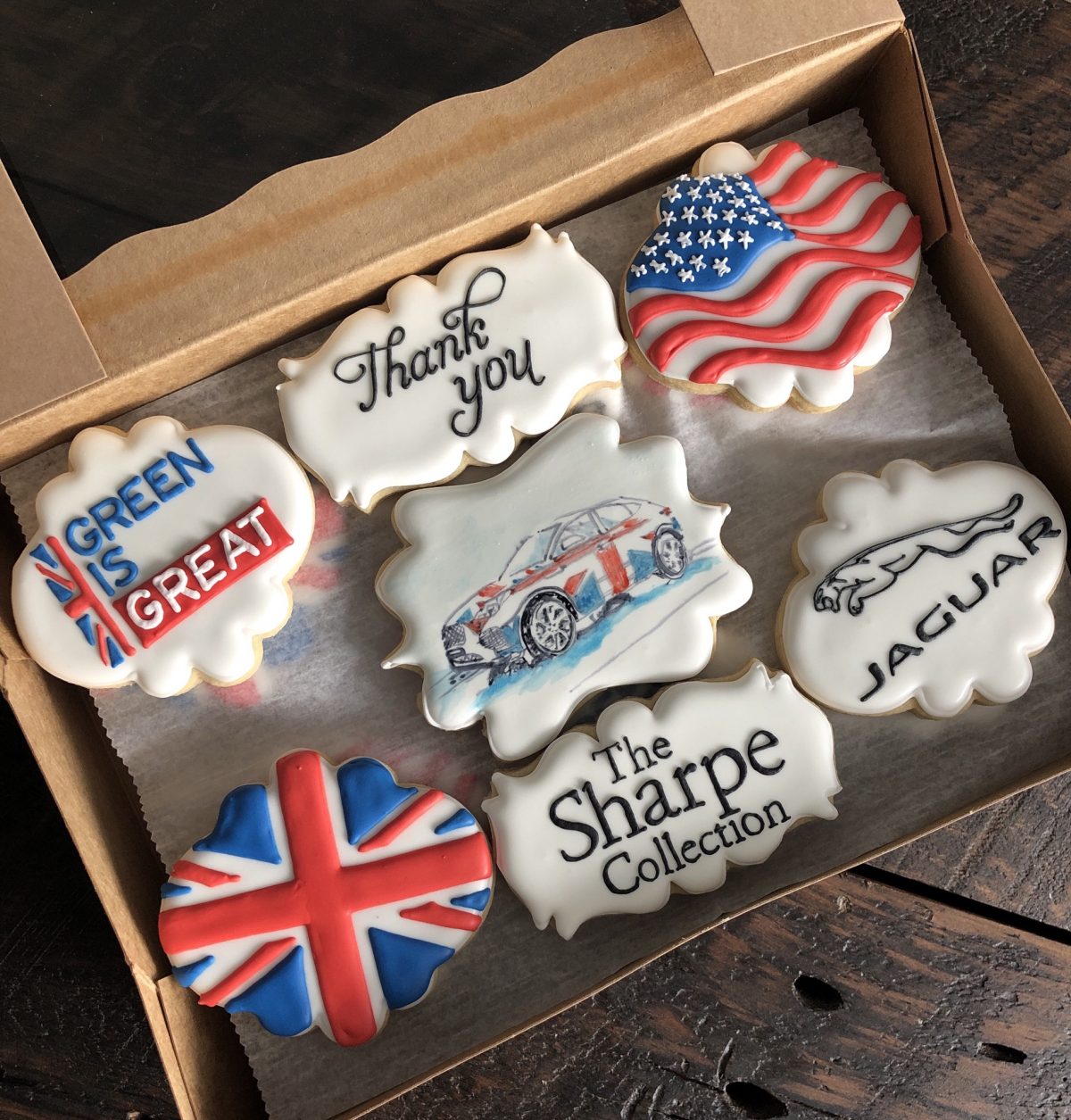
Ann is well known for her logo cookies…and it’s obvious why!
Let’s get down to the nitty gritty. I enjoy doing artistically styled cookies. You know, the ones that are meant to show people emotion. The ones that you have to dig down deep to find your pathway, and end up having to step away from numerous times. I don’t get many of those orders. Once in a while I get an order for a cutsie birthday party or a baby shower and I spend countless hours, it seems, looking at other cookies and clipart for inspiration. Those aren’t my favorite.
The amazing cookie Ann made for Katy Metoyer – from a photo of Katy’s dad
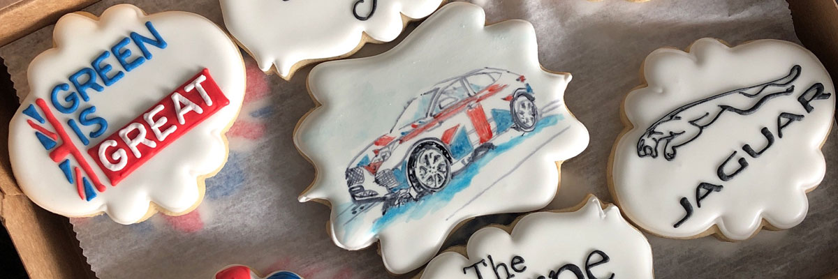
What I get the most orders for, are logos. Rows and rows of logos, and that’s what I love. Logos are already determined. I might have to take a second or two to decide what plaque to put them on. I don’t have to use my brain much, maybe a little for mixology in the form of a color palette. The only issue I have with them, on occasion, is being able to dedicate the uninterrupted time to stay focused and get into a groove. You have to get into a groove.
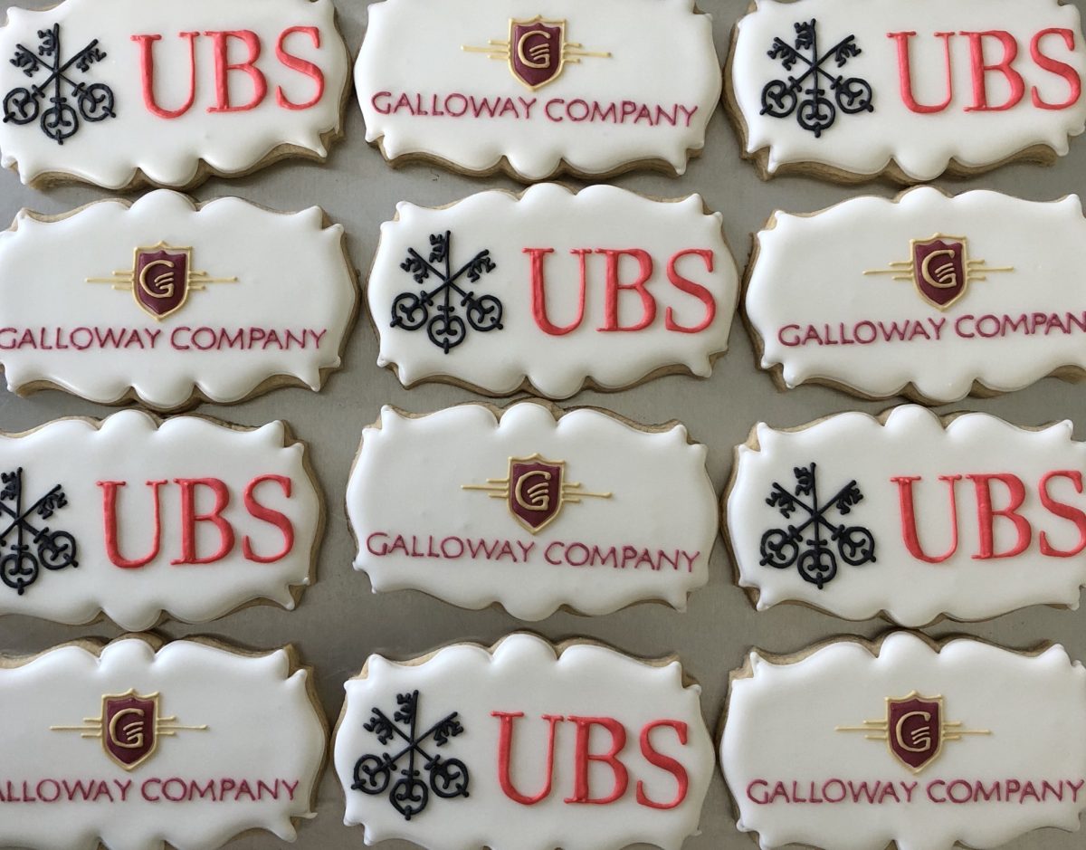
More of Ann’s logo cookies
Can you believe I do all these logos FREEHAND? Well, don’t. Before I even started to cookie, I bought a used KopyKake, then upgraded to a pico shortly thereafter. It wasn’t so big and clunky, didn’t take up that much space, I didn’t have to keep resizing my images with my printer and it was portable if I needed it to be. I was ready to rock and roll. Except…my image was upside down. Oh, well. I could work with that, and that I did. Somehow, I think piping letters upside became easier for me. In fact, even without a pico, if I try to pipe a word or name, it comes out much more legibly for me to do it upside down.
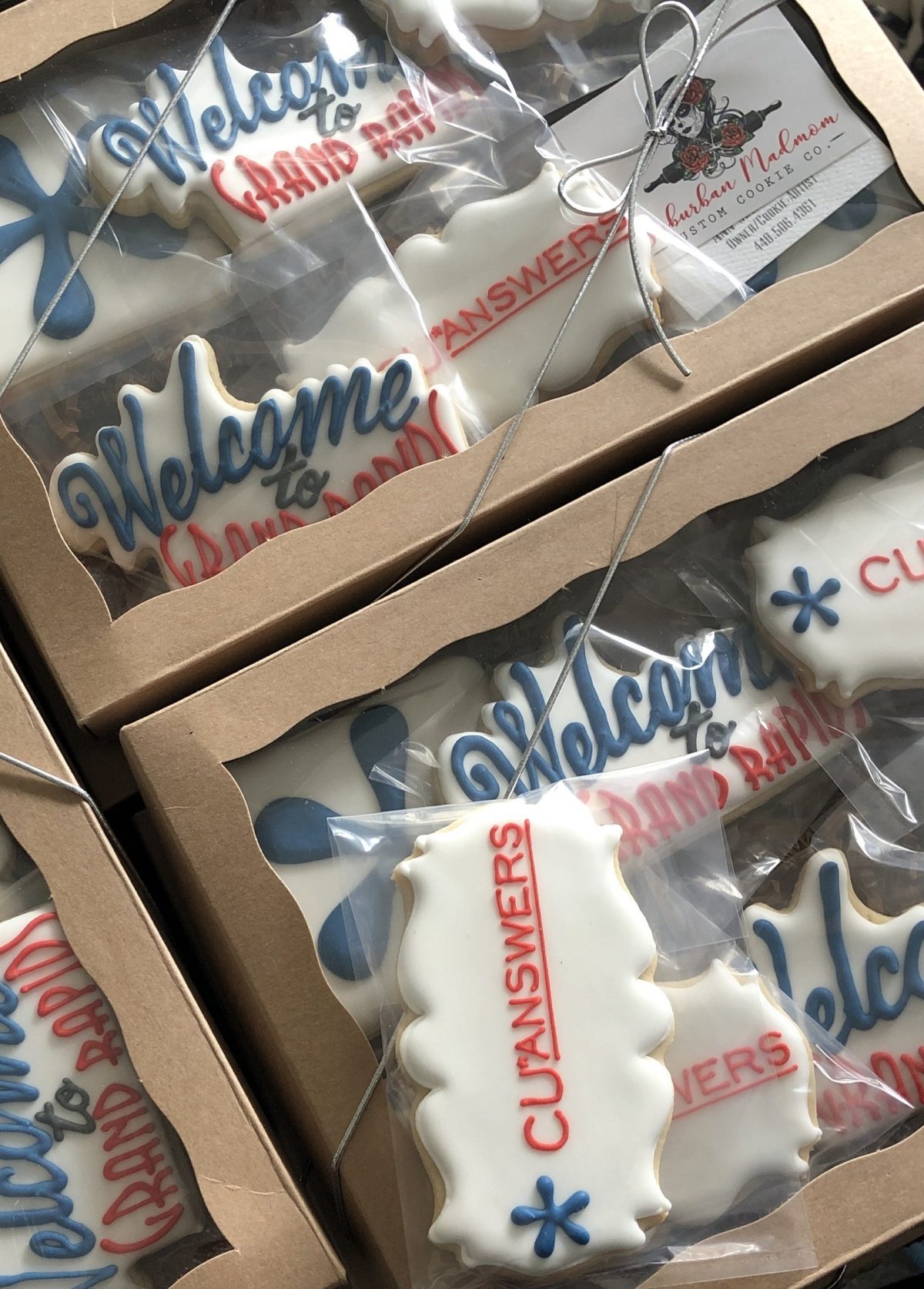
Onto the consistency. There are SO many amazing blog posts out there about consistency. I can’t even begin to compare. I’m sure I learned from trying many different things from many different blogs. I always start with stiff royal icing, then assess my logo for what consistencies are required. If there is a design to the logo, such as the Lincoln on my Lincoln Financial Group logos, I keep the icing a little on the thin side, maybe a little thicker than one would use for a flood, pipe the outline of the design and fill it right in with the design flood.
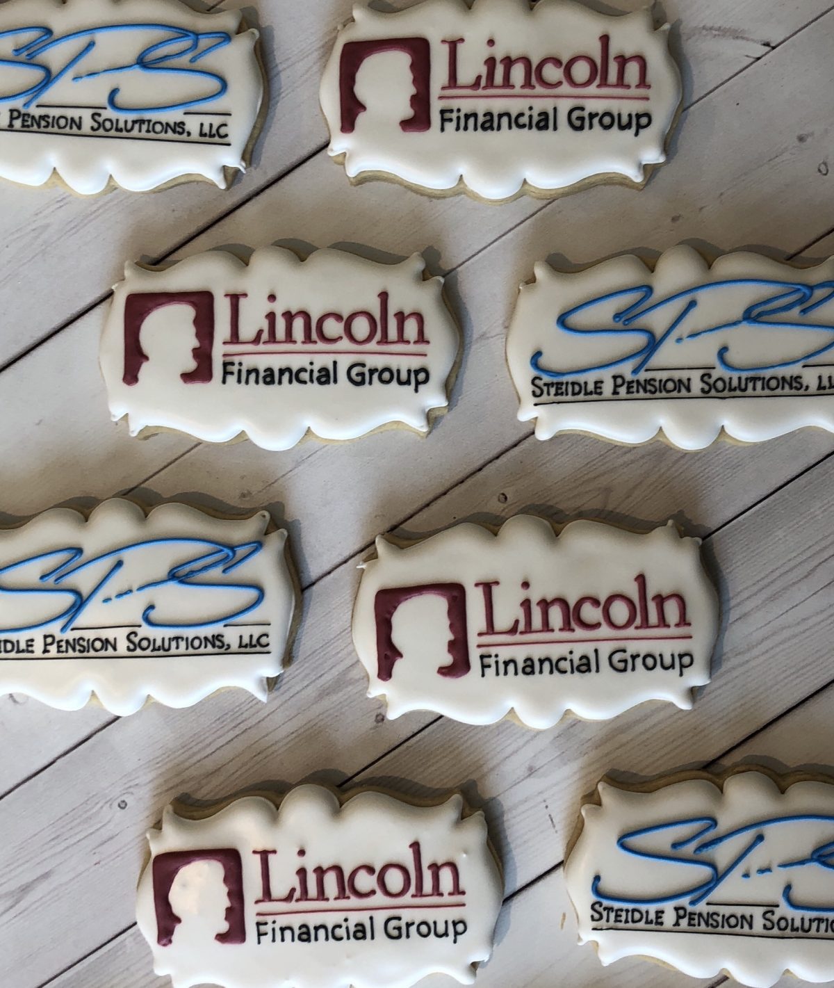
Some people might make it a little thicker and use a scribe to blend it all together and smooth it all out, but I just don’t have time for that. I pipe most of my letters or words with what most people would consider an outlining consistency…just slightly thinner than toothpaste. For really tiny piping, I add a squirt of water to make it just that much more fluid, and use the tip almost as a pencil, writing letters rather than piping. Also, I don’t use tips. Ever. (Unless I’m piping a flower, which doesn’t happen too often.) I prefer tipless bags because I’m too lazy to wash tips. I’ve also found that with tips it’s easy to squeeze a clog or a dried piece of icing that can make my lines wonky. I know where to hold the seam for my preference and I’ve learned to work with seams cut too big. All personal preference.
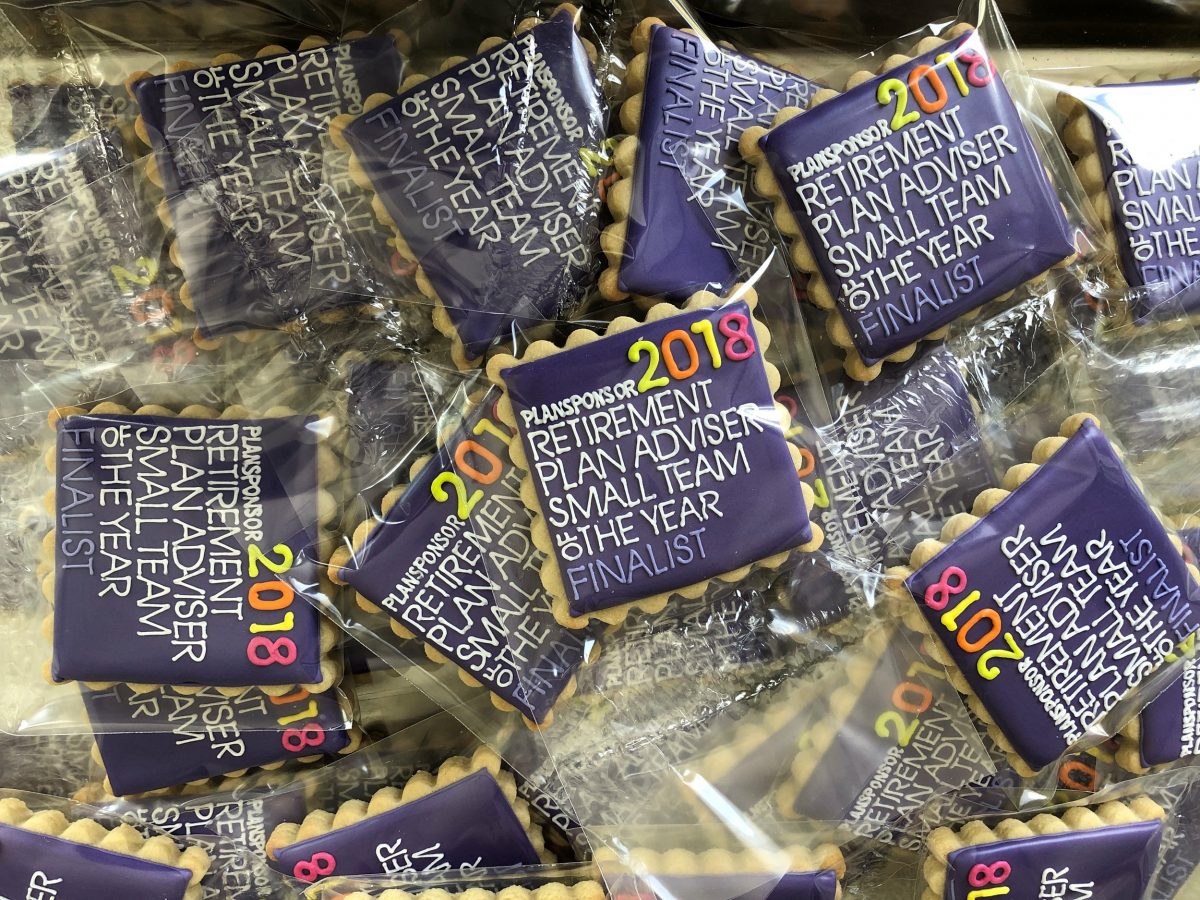
Amazing…and she does it all UPSIDE DOWN!
Now that all that is settled, I pull the image up on my pico (upside down, of course) and get started. I always work from left to right and top of my image to bottom. If there is a large picture on the left I would pipe that first. If there is tiny writing or a tiny design inside of another shape, that would also take precedence. After that it’s just piping. Each letter is piped top to bottom, left to right just as the whole logo is. It’s what works for me. As I said before, when it comes to teeny tiny letters, I use the tip of the bag similarly to a pencil, with the tiniest bit of a hole cut in the tip, with the icing a bit more fluid and “write” with the icing. Any other design to the logo gets done last.
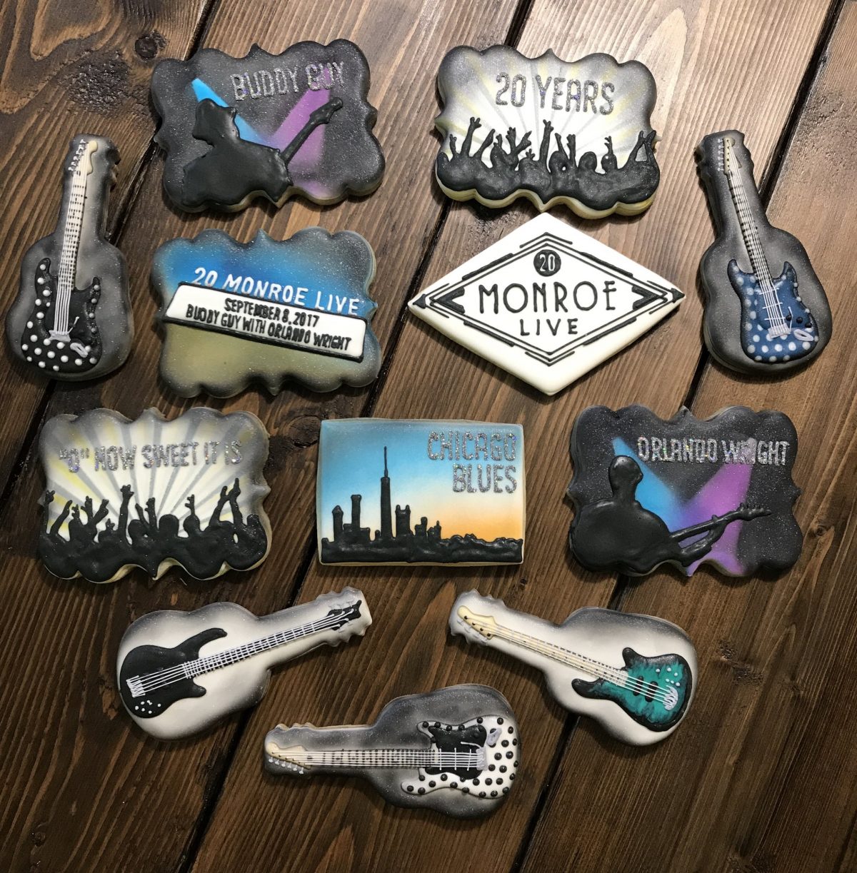
Ann rocked these cookies!
In the title of this post I say “better than mediocre” because I feel like it’s nearly impossible to pipe a perfect logo, although I’ve seen some come pretty close. A projector isn’t a miracle worker, and even though sometimes I wish I had a stencil to use, I find my clients prefer (and are willing to compensate me for) a hand piped cookie. “No iron ons”, my biggest client says, and he understands that a cookie is just that: a cookie. It’s a smooth, yummy confection made with love and sometimes plenty of aggravation.
It’s personalized, and people love that. They can see the work and the worth to each cookie. Just as in the Fable, The Tortoise and the Hare, slow and steady wins the race. Keep focused, don’t get discouraged, don’t take on more than you can handle in an amount of time that’s unreasonable and practice those lines. If you’re feeling a little daring turn your image back to upside down. Love what you do and everyone else will too!
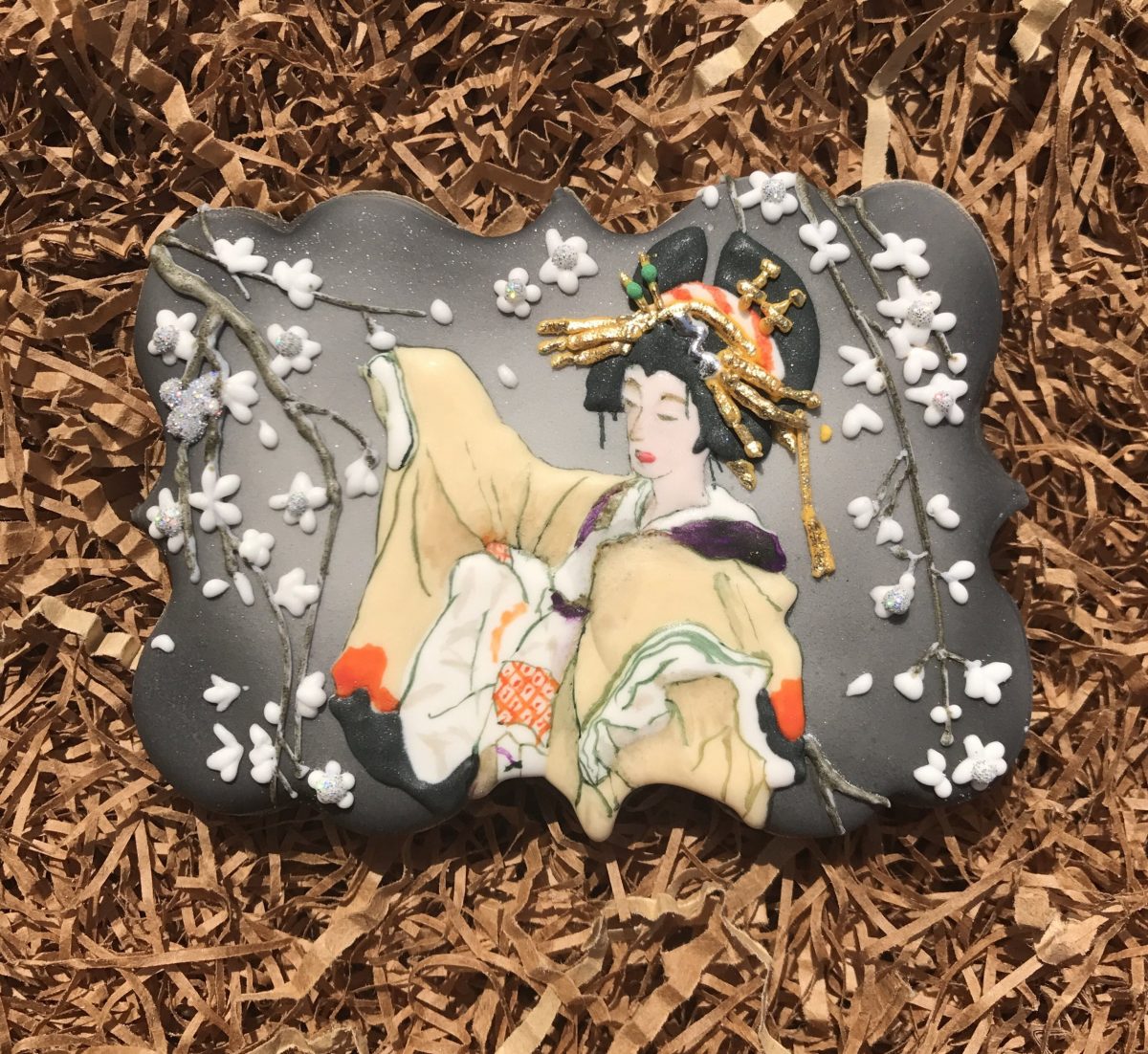
When she’s not piping logos, Ann makes beautiful cookies like this.
You’re lettering is amazing I would love to see a video of you doing this. I just have such a hard time with writing on cookies.